
Current component version: 1.6
API version: 67.0.
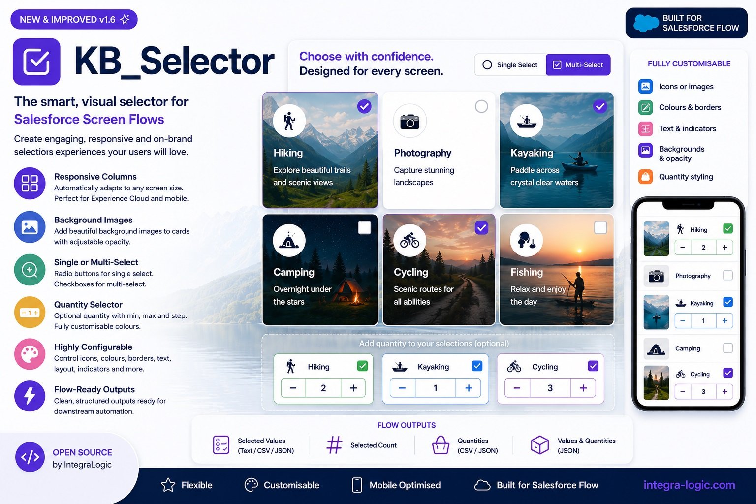
A highly configurable Lightning Web Component for Salesforce Screen Flows
KB_Selector is a modern card/list selector for Salesforce Screen Flows that allows administrators to build visually appealing selection screens without writing code.
Instead of creating multiple Screen Flow components, complex visibility rules or custom LWCs, a single JSON configuration controls the entire interface.
Typical Use Cases
KB_Selector is ideal for:
- Product selection
- Energy tariffs
- Service packages
- Insurance options
- Membership plans
- Event tickets
- Course selection
- Product bundles
- Quote configuration
- Experience Cloud portals
Key Features
Selection Modes
- Radio Button (single selection)
- Checkbox (multiple selection)
Card Layout
Supports:
- Configurable number of columns
- Responsive layout
- Card spacing
- Rounded corners
- Hover effects
- Selected state styling
Images
Cards may contain:
- Image URL
- Salesforce Static Resource URL
- External image
- Background image
Example:
{
    "imageUrl":"https://example.com/product.png"
}
or
{
    "backgroundImageUrl":"https://example.com/background.jpg"
}
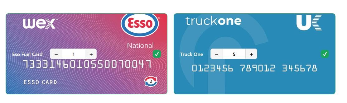
Background Images
Cards may contain full background images.
Example:
{
    "backgroundImageUrl":"https://i.postimg.cc/d3MzRz0P/Onecard.png"
}
Background images automatically:
- cover the card
- remain centred
- preserve rounded corners
Icons
Supports any SLDS icon.
Example:
{
    "iconName":"utility:animal_and_nature"
}
or
{
    "iconName":"standard:account"
}
Quantity Selector
Each item may optionally display:
Perfect for:
- Product ordering
- Licences
- Seat allocation
- Bundles
Colours
Fully configurable.
Supports:
- Card background
- Card text
- Quantity selector colours
- Selected colours
- Borders
- Hover colours
- Badge colours
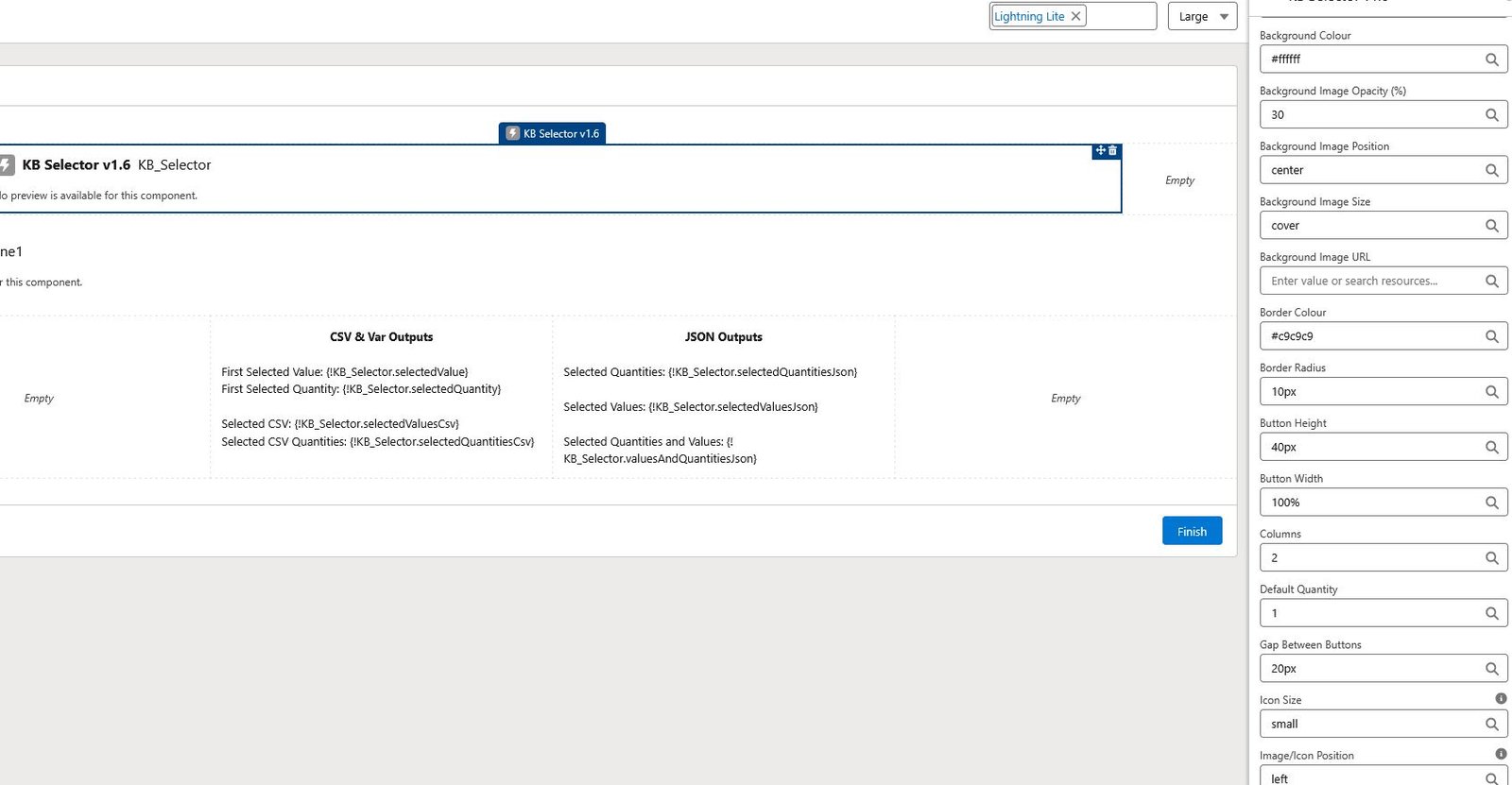
Recent version (1.6) separate:
- Card text colour
- Quantity selector text colour
allowing dark cards while keeping quantity controls readable.
JSON Example
[
    {
        "label": "Computers",
        "value": "computer",
        "imageUrl": "https://www.svgrepo.com/show/513093/macbook-pro.svg"
    },
    {
        "label": "Cameras",
        "value": "cameras",
        "imageUrl": "https://www.svgrepo.com/show/513123/photo-camera.svg"
    },
    {
        "label": "Shopping carts",
        "value": "shopping carts",
        "imageUrl": "https://www.svgrepo.com/show/513112/shopping-card.svg"
    }
]
Responsive Design
Automatically adapts to:
- Desktop
- Laptop
- Tablet
- Mobile
Cards wrap automatically based on the configured maximum number of columns.
Technical Notes
- Single or multiple selection
- Responsive card layouts
- Images and icons
- Background images
- Conditional styling
- Quantity selection
- Custom colours
- Flow output variables
- Mobile-friendly responsive design
Download:
Install in Sandbox
Install in Production
Disclaimer
I am not affiliated with or employed by Salesforce. All components and examples I share are independent projects and should be thoroughly tested in a Sandbox environment before being deployed to Production. Please ensure they meet your organisation’s security, governance, and business requirements.

Leave a Reply